Oil Painting Lesson Step 2
Posted by admin | Under Oil Painting Friday Apr 23, 2010 To start the lesson follow the steps below:
Read Introduction on Landscape Oil Paintings
Follow Oil Painting Lesson Step 1
Follow Oil Painting Lesson Step 2
Follow Oil Painting Lesson Step 3
Follow Oil Painting Lesson Step 4
Follow Oil Painting Lesson Step 5
Follow Oil Painting Lesson Step 6
Step 2
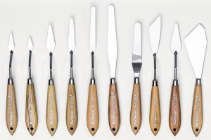
It is in Step 2 that form begins to emerge out of the lovely chaos. And so easily too! You don’t need to build a Hoover Dam to harness the raging waves of color. All you need is one broad horizontal band across the center of the painting. True, a stranger looking at your work still won’t know wha1 it is, but you will. You’ll know that this horizontal band is quite simply the dividing line between land and water while above it is the sky. No, it’s not yet a picture, but it now has the essential outline.
Using the palette knife, simply drag some paint from one end of the canvas to the other. Make the band broad. You’re not yet a craftsman and, even if you were, the more space you create to work with the better. Besides, we’re going to I, want many wonderful things to grow on this land, so don’t box yourself into a corner.
Now all such strokes of paint I call “schemers,” which I think is more descriptive than most of the technical terms I you’ll find in textbooks. Critics, for example, prefer “impasto” to “schemer” but I really think impasto goes better with tomato sauce. A more amiable term also used by some writers is “painterly,” which refers to art that is full of I schemers and noticeably heavy brush strokes. Everything that you and I will be doing together is “painterly,” since we f are not aiming at a severely realistic technique. Obviously you cannot do a realistic painting in only ten minutes. But member that the reputation of “painterly” art-which, after all, was practiced by the likes of Van Gogh and Goyano less great, simply because it can’t pass for photography and doesn’t even try. So despise not the humble schmeer.
Over the years I’ve learned to create the horizontal band with a single right-to-left stroke of the palette knife. But it took me many years to develop this skill, and no apprentice can expect to do it as nimbly at first. It’s not like learning to drive a car. A modicum of practice behind the wheel can enable most learners to negotiate a relatively sharp turn. But there is an awkwardness in trying to paint that won’t go away as easily. I think it’s totally psychological. No matter how enthusiastic the neophyte, painting still has the mystique of an elitist art. This mystique discourages deftness, and otherwise sure-handed people often start to fumble.
You should therefore expect to lay on any number of hori-zontal strokes before you arrive at an adequate schemer. I would even urge as many as ten strokes. Again, you never .vant to slop on superfluous paint, but excessive thickness is not too high a price to pay in order to master the basic techniques. After a little practice, the hardest part actually You might want to ask yourself, does this look like earth? )oes it flow naturally, as all land does? Is its hue strong enough to suggest a rich soil, but subtle enough to accommodate the brighter and more intense colors we’ll be adding later on? Of course, only after a few failures will you really develop a feel for what sorts of schemers serve the final product and what sorts don’t.
Just as, in Step 1, we touched up the abstract coat to give it depth and character, we must now in Step 2 make our horizontal schemer a bit fancier before we move on to Step 3. The key here is to remember that our horizontal band will have a very dark look to it. In fact, too dark. Even if we plan to use a fairly bright green the sheer massiveness of the horizontal will tend to weigh down the canvas. And we: don’t want our trees and leaves overshadowed by a ponderous layer of somber paint pulling at their base.
It is therefore important to add touches of lively color. Using the palette knife try little specks of yellow at various places along the bottom and top edges of the band. Not only will this lighten the effect, but it will further delineate any river bank. Yellow, perhaps a dark yellow, will serve to smooth this transition. You don’t want dark earth starkly juxtaposed against blue water. Nature is most often gradual, especially when it mixes its colors. We seldom find a purely green leaf or a purely brown bark. Things flow into each other; there are no precipices of green or red or blue sticking out like rock crystals against a landscape. So by flecking your schemer with yellow, not only do you help it fit in better with the rest of your canvas, but you create more realistic borders as well.
New artists should bear something in mind. There are moments when nature does actually present stark delineations-when the reeds do stand out like sculpted forms of green or brown against the sharp blue of the water. But just I because nature does it, that doesn’t mean that you should! The relationship between art and nature is very mysterious. A work that shows nature exactly as it is sometimes is the least realistic, most stilted and most artificial of paintings. The illusions of art are so enigmatic that, paradoxically, it is often the broadest, most “painterly” of strokes that seems most natural.
The point is, paint nature, not as it always is, but as people expect to see it. And that means, paint subtle colors that spill gradually into each other. I have mentioned yellow because yellow is an incredibly useful color. It can work well with just about anything else in the spectrum and is eminently functional for transitions, for softening a heavy tint, and for suggesting omnipresent sunlight.
Another color comparable to yellow both in appearance and usefulness is ochre. Ochre is wonderful because it suggest marriage of sun and soil; its brownish hue implies the solidity of earth while its golden tone tells us that this earth has also been subject to a sprightly dance of light. Again, have fun; there’s not much harm that you can do to your schemer with these small, vibrant points of yellow and ochre. Indeed, it was my practiced use of these colors that led the great Hyman Margolis to compare many of my landscapes to Monet’s Water Lilies.
Finally, use ochre not just at the borders, but within the Jody of your schemer as well. Variations in color, especially the application of lighter colors, will create the illusion of depth in your schemer just as the tips of the toilet paper add depth to your initial abstract coat. It is not, however, necessary to use toilet paper for any task in Step 2, although it will help.
Already we have the outline of a landscape. We have sky, we have water, we have land. And just as important, we have used lighter colors to create an illusion of depth throughout Now comes the time to draw the actual face of nature.

[...] Oil Painting Lesson Step [...]